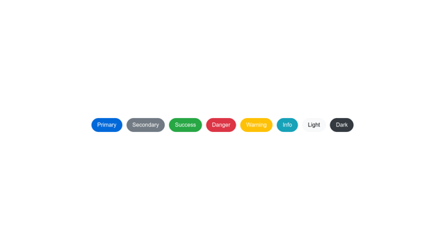
Generating variants of common interface components like buttons, inputs, cards, etc., has typically involved multiple class names, pre-processor mixins, or repeated code. Now, component variants can be created in a clean and straightforward manner using CSS variables.
Let’s take creating buttons as an example. I want to replicate the familiar set of buttons made popular by Bootstrap and similar frameworks that includes primary, secondary, success, danger, warning, info, light and dark variants.
Base Styling
Link to this sectionI’m going to start by giving these buttons some base styling. I can give the button a base class and then add additional classes for each variant.
<button class="button is-primary">Primary</button>
<button class="button is-secondary">Secondary</button>
.button {
display: inline-flex;
align-items: center;
justify-content: center;
width: auto;
height: 2.5rem;
padding: 0 1rem;
border-radius: 4px;
}Defining Variables
Link to this sectionNext I’m going to define some variables on the root. These will be the properties that need to change with each variant.
:root {
  --button-border-color: gray;
  --button-text-color: white;
  --button-background-color: gray;
}
I will use these to add color to my base styling:
.button {
  /* ... */
  border: 1px solid var(--button-border-color);
  color: var(--button-text-color);
  background-color: var(--button-background-color);
}
Overriding Variables for Component Variants
Link to this sectionFinally, I will override these variable values within each variant selector.
.button.is-primary {
  --button-border-color: #0069d9;
  --button-text-color: white;
  --button-background-color: #0069d9;
}

.button.is-secondary {
  --button-border-color: #727b84;
  --button-text-color: white;
  --button-background-color: #727b84;
}

/* ... */
Alternate Selector Scheme
Link to this sectionIf I wanted to simplify my classes further, I could use only one class to define both the base styling and the variants.
<button class="button-primary">Primary</button>
<button class="button-secondary">Secondary</button>
Here I’m nesting variant selectors with PostCSS:
[class^='button'] {
  display: inline-flex;
  align-items: center;
  justify-content: center;
  width: auto;
  height: 2.5rem;
  padding: 0 1rem;
  border: 1px solid var(--button-border-color);
  border-radius: 4px;
  color: var(--button-text-color);
  background-color: var(--button-background-color);

  &[class*='primary'] {
    --button-border-color: #0069d9;
    --button-text-color: white;
    --button-background-color: #0069d9;
  }

  &[class*='secondary'] {
    --button-border-color: #727b84;
    --button-text-color: white;
    --button-background-color: #727b84;
  }

  /* ... */
}
Check out the Codepen for the working result:

Button Variants with Scoped CSS Variables
Click here to view the experiment on Codepen
Browser Support for CSS Variables
Link to this sectionFor browsers that do not support custom properties at all, you can use the PostCSS custom properties plugin. This will compile the CSS variables as static values.
Keep in mind, however, that this will not allow you to override variable values, as the variables will no longer exist in the browser, having already been evaluated during the CSS build.
The technique for component variants described in this article is future-looking and, as more and more browsers fully support custom properties, will be able to be used in production sites.
Get a Quick Start with HiQ
Link to this sectionMy new CSS framework HiQ lets you get started quickly by providing variables that you can customize and then override within your variant selectors. Check out the Buttons section for an example.
In addition, you can use the theme builder for a visual editing experience as you customize your own theme.
HiQ is lightweight and provides truly fluid typography that changes in relation to the viewport width. It is built using PostCSS and can be integrated into your own project as a single static file, or as part of your own PostCSS build.
You can learn more about CSS variables in my article here:
Unlocking the Benefits of CSS Variables
More and more developers are starting to use CSS variables, or as they are more correctly known, custom properties. Native CSS custom properties…